Redefining
Online Pharmacy
Order medicine in a minute by uploading your prescription and get it delivered to your doorstep within 30 minutes. No more hassle or worry about ordering the wrong medicine. Focus on recovering while we take care of the rest.


IMPACT
These achievements were accomplished within 12 months through the release of numerous features and optimization of operations and business model.
Context
In December 2020, Practo set a goal to make its e-pharmacy product profitable. Up until that point, the business had invested heavily in the e-pharmacy as part of a retention strategy, aiming to keep customers engaged and loyal. However, the focus needed to shift towards making the product financially self-sustaining. This meant improving conversion rates to generate more revenue, which could help optimize operations and reduce costs. The goal was to ensure the e-pharmacy could stand on its own financially, contributing positively to Practo's overall profitability.
Problem
95% of the users were dropping off for unknown reasons, and the product's CSAT was averaging only 3.5 stars. The current experience had been built by benchmarking against e-commerce apps and competitors. Due to the fast-paced environment and a company philosophy of "fail fast", we had never conducted structured consumer research to identify the needs of our own users. Our primary challenge was to identify the specific deal breakers causing users to leave, so we could address these issues and improve conversion rates.
Objective
Research, strategize, and design an end-to-end experience to help users order medicines, with the goal of increasing conversion rates by 25% and improving the CSAT from 3.5 to 4.5 stars.
Process
We heavily invested in the conceptual stage and synthesis process, actively involving internal stakeholders to align on critical decisions in operations and business models.
1. EMPATHISE
2. CONCEPTUALISE
3. DESIGN
Getting started with the problem discovery
Drop-off survey:
We conducted a drop-off survey with users who recently left to structure our consumer interviews. Using the drop-off data, we targeted three groups for in-person research. Below are the main groups we focused on:
a. Users who couldn't find their prescription medicine
b. OTC medicine users who couldn't find their medicine
c. Users who switched to a competitor app or found a solution outside the app
User interviews:
We conducted user research with 24 users, averaging 8 per segment. The aim was to delve deeper into the app's current experience and gather insights. We tried to understand their general behavior and mindset when buying online. Furthermore, we observed their behavior while using competitor's e-commerce apps and then asked them to use our e-pharmacy product.
Conceptualise
We used a design sprint model to synthesize the research outcomes, generate insights, and develop potential solutions. This was crucial because we identified issues that required operational changes and possible adjustments to the revenue models.
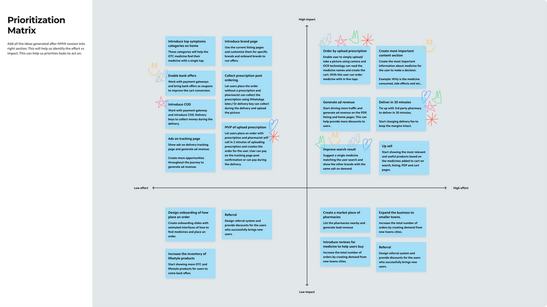
We used "How Might We" questions and affinity mapping, followed by a prioritization matrix, to create a high-level roadmap for our e-pharmacy.
Below are some artboards from the synthesis process, illustrating our approach.
Research & design sprint summary
After a successful design sprint, all stakeholders agreed on the top problems and proposed design directions. These include only the major items.
Top Problems to be solved on priority basis:
-
Current search experience is very confusing and 80% of the users drop due to not being able to find the medicine they are looking for.
-
Near to 100% of our users land here with a clear idea of what to buy and they are dropping due to a bad discovery experience. 80% of them have a prescription and they find it easy to go to a shop nearby.
-
32% of users drop in the cart due to finding the prices too high and no presence of discounts.
-
30% of users bounce at cart due to very high delivery time. 48 hours.
Design directions
-
Design the search experience customised more for medicine discovery. Avoid the abundance and present that single medicine user is intended to buy.
-
Design an experience for a user to order medicine by simply uploading a prescription.
-
Introduce cash on delivery, bank discounts and 50% off for the first time users.
-
Reduce the delivery TAT from 48 hours to 30 minutes.
-
Improve the recommendation and upsell engine to show the right product at the right time to the right user to increase AOV.
Creation of a product & design roadmap for 2 quarters to achieve profitability
Experiences which led to profitability
*All the prototypes presented below are figma mocks and not the production quality.
Simplest medicine ordering experience
The user can upload a prescription, our OCR technology is able to read it and create the cart.
This is the easiest medicine ordering experience ever designed in the country.


Tailor made search experience for medicine
Now users are presented with the most relevant product they are looking for by avoiding the abundance of choice.
Also our algorithms understand the first item added by the user and start recommending most commonly purchased products together.
Key screens that made the product profitable

Optimisation of the home page for the top 3 user needs which solves discovery issues for 80% of the users.

Tailor made search for pharmacy users. Search drop reduces by 70% with improved experience.

Symptom listing page that improved discovery and conversion for OTC medicine users.

OTC category pages to enhance top-of-funnel & encourage repeat use among non-prescription users.

Creation of a category-level listing page with educational content about the category.

Brand pages to engage non-prescription users and drive revenue through brand reach.

Redesign of the product detail page with the most important information for the user to buy.

Redesign of the cart to enhance trust with free cancellation, 30-minute delivery, and special offers. Cross-selling was most effective on the cart page.

Introduction of a delivery options page, increasing conversion and margins through delivery fees.


